Wednesday, May 18, 2011

Photograph #24


Title: none
Author: James Strachan
URL: gosu.co.za

This picture is really interesting and tells a story. It makes me think about what is going on, and why this person is in the brick room. The view from the room is beautiful and I love how the photographer was sure to capture the mountains and fog. It seems ironic that the inside is so tortuous and the outside is so beautiful and open (like freedom).

Photograph #23

Early Morning Angkor


Title: Early Morning Angkor - Angkor Wat Cambodia
Author: Jason Strachan
URL: gosu.co.za

Immediately, I figured that the photographer of this picture was trying to display a depressing or sad tone. He used dark colors, and very high contrast between the boat and the water. I love the reflections onto the water from the trees and the boat, and I also love that he chose to give two-thirds of the frame to the water and boat. My attention is focused on the boat and the story behind it.

Photograph #22

Love Locks


Title: Love Locks, Via Dell'Amore, Italy
Author: Jason Strachan
URL: gosu.co.za

This picture has a lot going on in it, but I think the photographer made a good desicion to place the locks in front of the sky where they could be visible. I love the fact that lovers placed these locks on the fence to show their love for one another. Out of the hundreds locks on the fence, I love that the photographer chose three different kinds. This picture just makes me wonder.

Photograph #21

Makeup Pencils


Title: Makeup Pencils
Author: Mark Meyer
URL: www.photo-mark.com

I LOVE makeup and as much as I tried to convince myself that I did not find this picture interesting, I couldn't. I love the unique and simple colors of pencils chosen, in addition to the few brushes. I love the different sizes of pencils and the fact that the background is pure white. The simplicity of this picture makes it so appealing to my eye.

Photograph #20

Rothko Homage / Old Sponges and Toast


Title: Rothko Homage / Old Sponges and Toast
Author: Mark Meyer
URL: www.photo-mark.com

What's funny is that I had no idea this photo was of toast until I read the title; I thought both photos were sponges! It is interesting that the photographer chose to use dull colors (browns) and bright colors (blue and yellow) right next to one another. To me, it makes the photo come to life.

Photograph #19

Team Roping


Title: Team Roping, Wyoming
Author: Mark Meyer
URL: www.photo-mark.com

It was a good decision of the photographer to put this photo in black and white. I love the action going on, and the dust flying. Also, I like that the man riding the horse is cropped out because it puts more focus on the bull and requires more imagination of the viewer.

Photograph #18

Lago de Atitlàn and Lake Hauroko


Photo on top: Lago de Atitlàn, Guatemala.
Photo on bottom: Lake Hauroko
Author: Tom Robinson
URL: www.tomrobinsonphotography.com


Each of these similar photos are so cool! I love the colors in the photo on the top, but I love how the picture on the bottom is much simpler. The photo on the bottom gives off more of a sad tone because of the dark colors. For both of the pictures, the photographer gave two-thirds of the frame to the water and its stillness.

Photograph #17


Title: Salar de Uyuni, Bolivia
Author: Tom Robinson
URL: www.tomrobinsonphotography.com

Like the photo posted before this, I immediately noticed how the photographer choose to dedicate two-thirds of the photo to the sand (or whatever this is). I kind of wish that the picture would have a little more color, but then again, I kind of like that the colors in the picture are very simple and clean.

Photograph #16

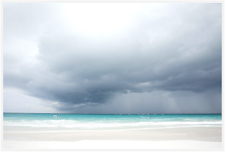
Storm Clouds


Title: Storm Clouds. Tulum, Mexico
Author: Tom Robinson
URL: www.tomobinsonphotography.com

The reason why I chose this picture is because I noticed that the photographer devoted over two-thirds of the frame to the clouds. I think he really wanted to focus on the storm and how powerful the clouds look. It is kind of ironic to me because the ocean is SO pretty and the clouds just look terrifying!

Photograph #15

Cross on the Hill


Title: Cross on the Hill. Tilcara, Argentina
Author: Tom Robinson
URL: www.tomrobinsonphotography.com

I love the sky in the this photograph. It is cool that the cross is in front of the sky so it contrasts and adds a focus on it. I also like that the cross is off centered. 

Photograph #14

Walking on the Beach


Title: Walking on the Beach. Playa Cocles, Costa Rica
Author: Tom Robinson
URL: www.tomrobinsonphotography.com

This photo really caught my eye when I glanced at the photographers website. I love the contrast between the trees and the rest of the photo. I also noticed that the trees make a frame for the man walking on the beach. This picture stands out to me because of its sepia tone.

Tuesday, May 3, 2011

Photograph #13


Title: none
Author: Greg Gorman
URL: http://www.gormanphotography.com/Portrait/

I'm not so sure why, but I love this photo. I think it gives a very deep emotion to the viewer based on the way the model holds herself. In my eyes, she seems to be searching and hoping for something. The backdrop of the photo adds texture.

Photograph #12


Title: none
Author: Eleanor Hardwick
URL: http://eleanorhardwick.com/

I love the fact that all of the colors in the photo are similiar; Everything has a nude tint. The woman in the window really gives an emotional effect to the photo and makes you wonder what is going on in her head.

Photograph #11


Title: none
Author: Eleanor Hardwick
URL: http://eleanorhardwick.com/

Although I don't LOVE this picture, I immediately noticed the contrast between the models dress and the cave she is standing in. This picture just reminds me of summer.

Photograph #10


Title: none
Author: Jeff Stephens
URL: http://jeffstephens.com/#/Portfolios/SimpleThings/1

For some reason, this photo really stands out to me. I love how Jeff Stephens took something so simple (I'm not sure if that is paper or what) and made it into something so cool. I looks to me like a flower and I love how the simply white background has a tint of yellow too.